Timeline
6 weeks
Role
Product Designer
Skills
Product Design
UI / UX Design
Team
Worked independently with guidance and periodic review from the design lead

Introduction
Embodied intelligence is evolving at an unprecedented pace. The training, invention, and testing of autonomous systems such as robots, self-driving cars, and smart electrical appliances, all rely on the effective ingestion, processing, and utilization of scene data.
coScene is a pioneering tech company developing foundational tools that focus on sceneops (scene operations) data processing. Their product offers significant value across industries that depend on complex data operations.
This project aims to build coScene an official website that expands its market influence and strengthens its branding.
UX Method
I first started by studying the product through direct experience and reading documents to learn its key features, advantages, unique qualities, and the big picture of the product. This was important because later I needed to make many design decisions about how to translate this information into design that would attract users.
After thoroughly understanding the product, the second step was identifying the user profiles of the website. This mattered because it determined what functions the website should provide and what goals it needed to achieve.
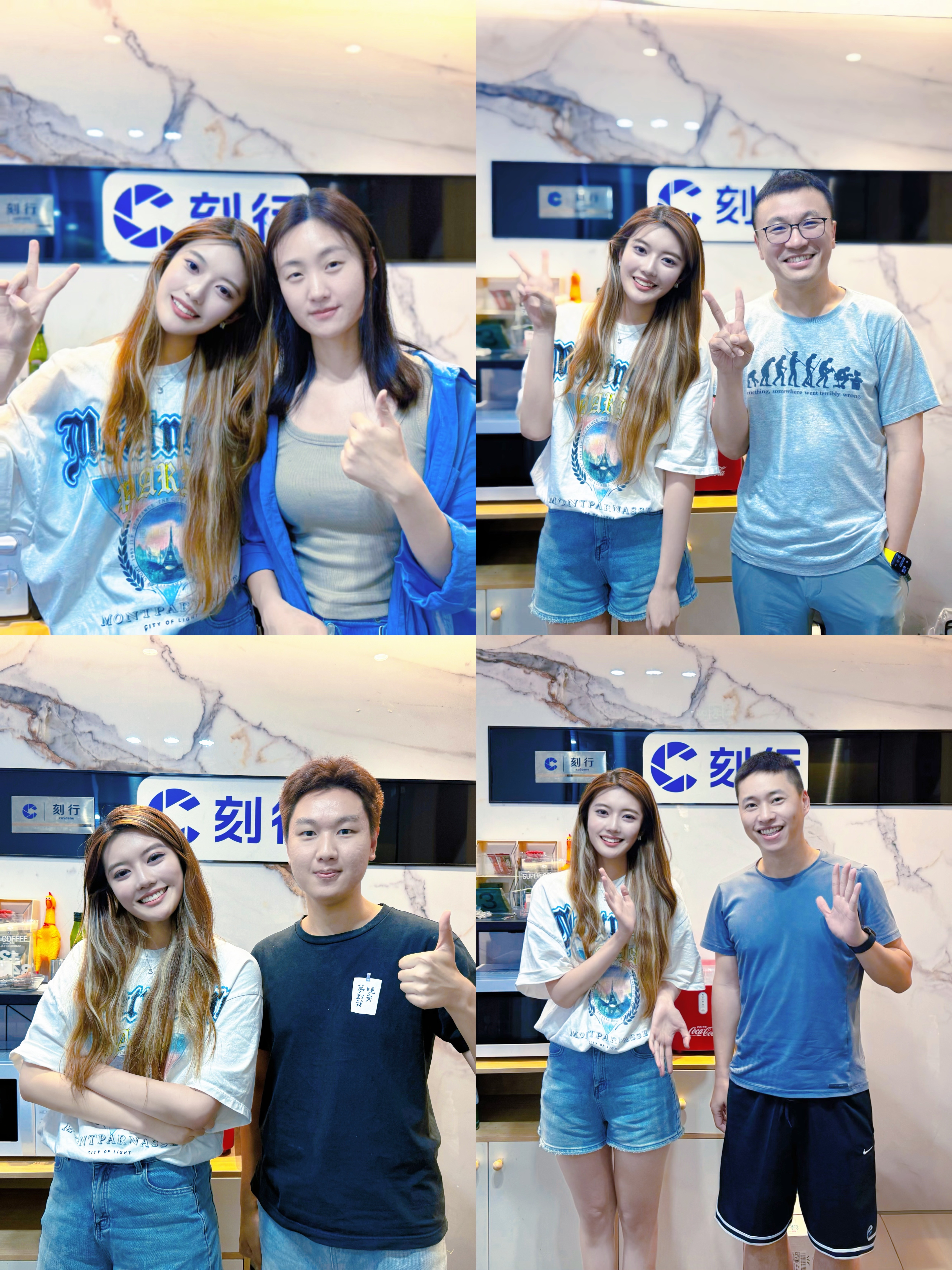
Next, I ran usability tests with coScene employees to uncover pain points in the initial website experience and discussed with them what they thought were the pros and cons of the initial design, as well as what they believed was most important in the coScene website design.
In parallel, I also conducted competitive analysis of similar data and robotics companies to benchmark best practices.


Part of the feedback docs I wrote for the initial website design
Market Research
These competitors share many functional similarities with coScene’s product, and I referred to their official websites for inspiration before starting my design.
Problem & Design Solution
User painpoint:
Users tended to scroll through the old website too quickly. The experience lacked clarity and left no lasting impression. The first few seconds of browsing are when user interest is highest. This moment needs a strong visual “hook” to capture their attention.
Design challenge:
The first screen of the website needed to immediately capture attention and highlight the product’s core features. However, as a To B product, coScene had limited visual elements and a high degree of logical complexity. It required extensive content sorting and close collaboration with both engineering and marketing teams to identify and communicate the right product story.
User painpoint:
Users often left the old website without a clear understanding of coScene’s value proposition—especially if they weren’t in a technical role.
Design challenge:
As a To B product, coScene needs to communicate its core functionalities to a wide range of users, including those without technical backgrounds. To do that, I first had to fully understand the structure of the entire platform from a micro perspective and then find effective ways to translate and visualize it.
User Painpoint:
coScene operates as a foundational and highly customizable framework, users often struggled to understand how it supports them across different stages of their workflow. Enterprise clients and engineers found it difficult to connect the product’s technical capabilities to their specific pain points, and this lack of clarity made it challenging for stakeholders to recognize coScene’s value in their day-to-day operations.
Design Challenge:
One specific challenge I faced was organizing different pain points and customer needs across each functional section of the product and tailoring the right solutions to each type of user.
I conducted user interviews across different scenarios and created a problem–solution mapping system to figure out the problem. For each common user pain point, I need to clearly communicate the solution. This helped improve clarity, persuasion, and overall engagement with the product story.

Deployment & User testing
Usability testing:
Gathered feedback to identify navigation friction, content inconsistencies, and interaction issues, then refined the design to improve clarity and ease of use.
Cross-device validation:
Tested across multiple devices and screen sizes to ensure a consistent, responsive, and accessible user experience.
Personal Learning
Quickly adapting to complex systems
Built a rapid understanding of autonomous system workflows to inform design decisions.
Turning complexity into clarity
Learned to translate abstract technical functions into intuitive, user-centered interfaces.
Effective cross-team collaboration
Collaborated with programmers, clients, and marketing teams to align diverse perspectives and gather actionable insights.